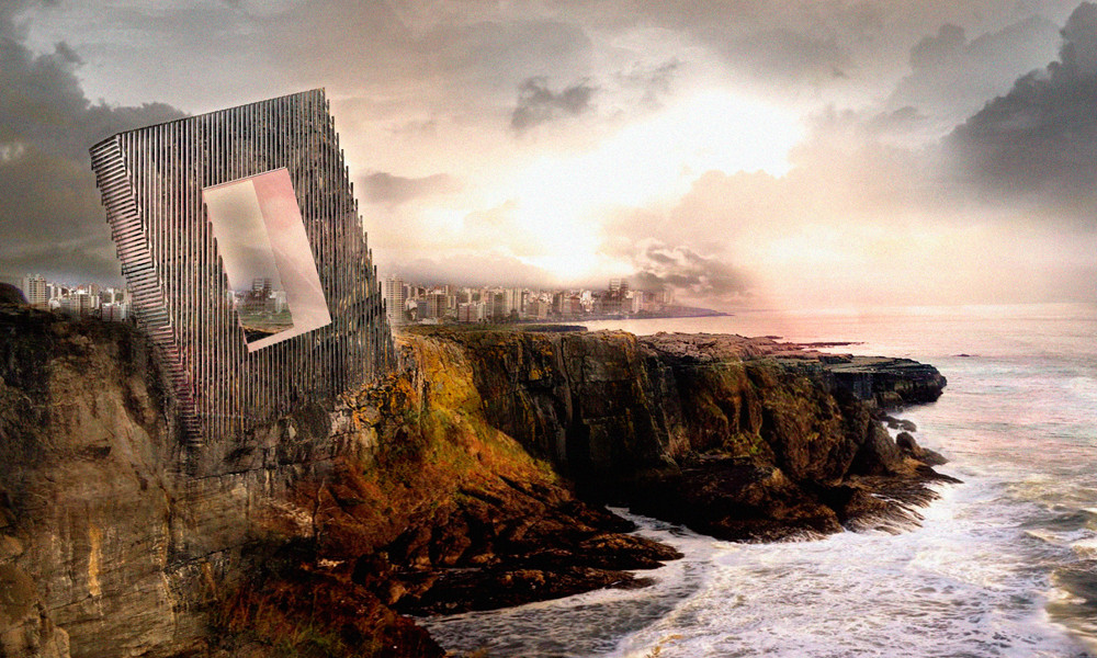
At the opening of his latest article for The Guardian, Olly Wainwright finds himself observing a slew of thesis projects produced by the best and brightest students of the UK. But Wainwright is most struck - not by the display of technical skill or imagination - but by the sheer lack of connection these projects had with actual, built, imperfect architecture: “Time and again, the projects seemed intent on fleeing the real world of people and places, scale and context; retreating instead into fantasy realms of convoluted forms with no seeming purpose.”
It’s a trap that many Architecture schools have fallen into, in the UK and around the world, but it’s not just a symptom of the misguided nature of architecture education. It’s also symptomatic of Architecture’s obsession with the image of architecture, an image completely detached from reality.
More after the break...

The idea of the perfect architectural image is not only propagated by professors who prioritize the rendering over its practical implications (causing students to spend hours perfecting visuals instead of perfecting the design), but also by the architecture media (and yes, we include ourselves in that category). Architecture media presents a flood of glossy shots that "sell" an idealized architecture to the public and, frankly, architects themselves.
In his essay “Digital Deception”, written for Design Observer, Belmont Freeman laments this obsession with the perfect, photo-shopped image, which has become - thanks to technology - far too easy to achieve: “our eyes are trained to believe that a photograph is a true representation of an existing condition. Thus in the digital age the graphic representation of architecture has moved beyond an exercise in persuasion; it has become an exercise in deception. [... The architect] has every incentive to indulge in digital dissimulation and little risk in doing so. Photoshop and similar software have become the architectural profession’s pharmacy of performance-enhancers; impossible to detect and absolutely ubiquitous."
Freeman's point of "deception" is an important one. I believe architects have bought into this idealization of the image not just because of their education or the influence of the media, but also, as I suggest in my review of CLOG: Rendering, because it's a therapeutic act of self-deception. Working on the theories of Jonah Hill, I write that photo-shopping “allows the architect to see his work as it was before being built, an un-compromised vision.”

The danger of this is that, in the end, as CLOG contributor Wenzel says, “the image exists independent of the concept, to be evaluated as a graphic. Architecture by graphic design” (Wenzel 73). In other words, the architecture itself is erased, eclipsed by its image. And that has real consequences. As Freeman puts it: "I fear that the proliferation of such photographs leads clients and the public at large to expect from architecture and architects a degree of quality — perfection — that is impossible to deliver in the real world.”
So what does this mean for the rendering?

Renderings, often slightly idealized, are necessary to try sell the idea of a design to a client, in which case a bit of artistic leeway is a necessary evil. However, once that idea is sold, what happens when a more realistic rendering, one which shows as truthfully as possible how the building will look (air conditioning units and all) is presented?
In an age in which the rendering (and the architecture media in general) has already set expectations far higher than reality could achieve, is the realistic rendering (forgive the pun) rendered useless? Could a stylized rendering actually be bad for the project, and bad for architecture in general? Should we all, like Peter Zumthor famously does, stick to models and foresake renderings altogether?

What do you think? Is it OK that renderings be idealized in order to sell a design? Is it just plain wrong? Should we attempt to present architecture as realistically as possible, in both images and renderings, in order to eliminate unrealistic expectations (for clients and ourselves)? Let us know in the comments below.

